Viewing and interpreting Wind Module data with Wind or Pollution Roses on Dashboard
💡 Tip: This feature is only available if you have a Clarity Node-S + Wind Module.
- If you'd like to learn more about the Wind Module, please fill out this form and we'll be in touch!
- If you'd like to deploy your Wind Module, please check out the Wind Deployment Guide. You'll need to configure your Clarity Node-S device first.
The Clarity Node-S + Wind Module work seamlessly together to provide you with air quality and wind measurements. One way to visualize the wind speed and direction data they collect is with a wind rose.
A wind rose lives on the Historical Data page. There are two places it appears:
- As a full Wind Rose chart inside the Advanced Charts panel.
- As a small rose overlaid directly on the map, using the Wind Roses toggle.
This article walks through both.
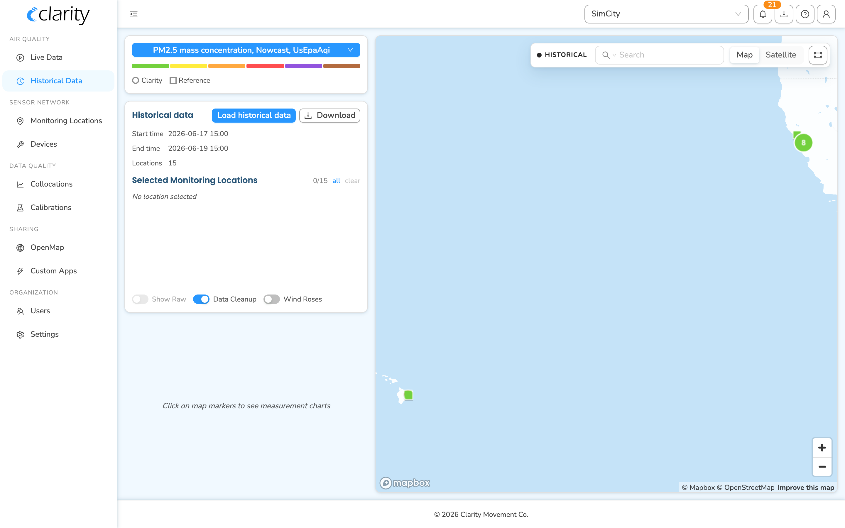
Finding the Wind Rose
- Sign in on Dashboard.
- In the left sidebar, under AIR QUALITY, click Historical Data.
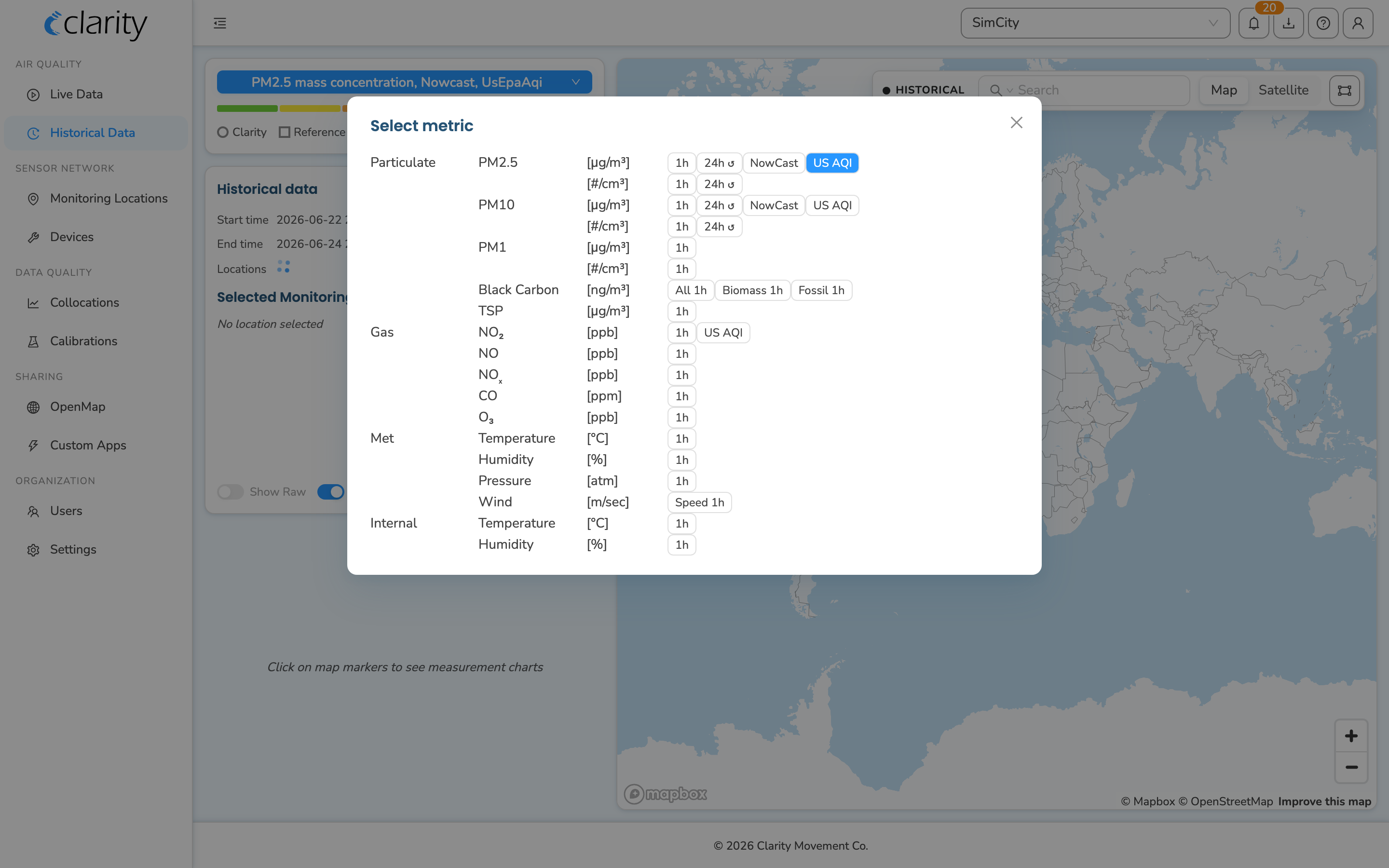
- At the top of the left-hand control panel, click the blue metric pill (it shows the metric currently in view, e.g. PM2.5 mass concentration…). In the Select metric window that opens, choose Wind, then close the window.
- On the map, click a Clarity monitoring location that has a Wind Module attached, so it's added to your selection. Marker colour reflects the chosen metric, and a wind-enabled location will show wind data once Wind is selected. You can select more than one location.
- A small Time Series chart appears in the left column for your selection. Click Advanced Charts in that chart card.
- The chart expands into a wide panel with a list of chart types down the left side. Click the Wind Rose tab.
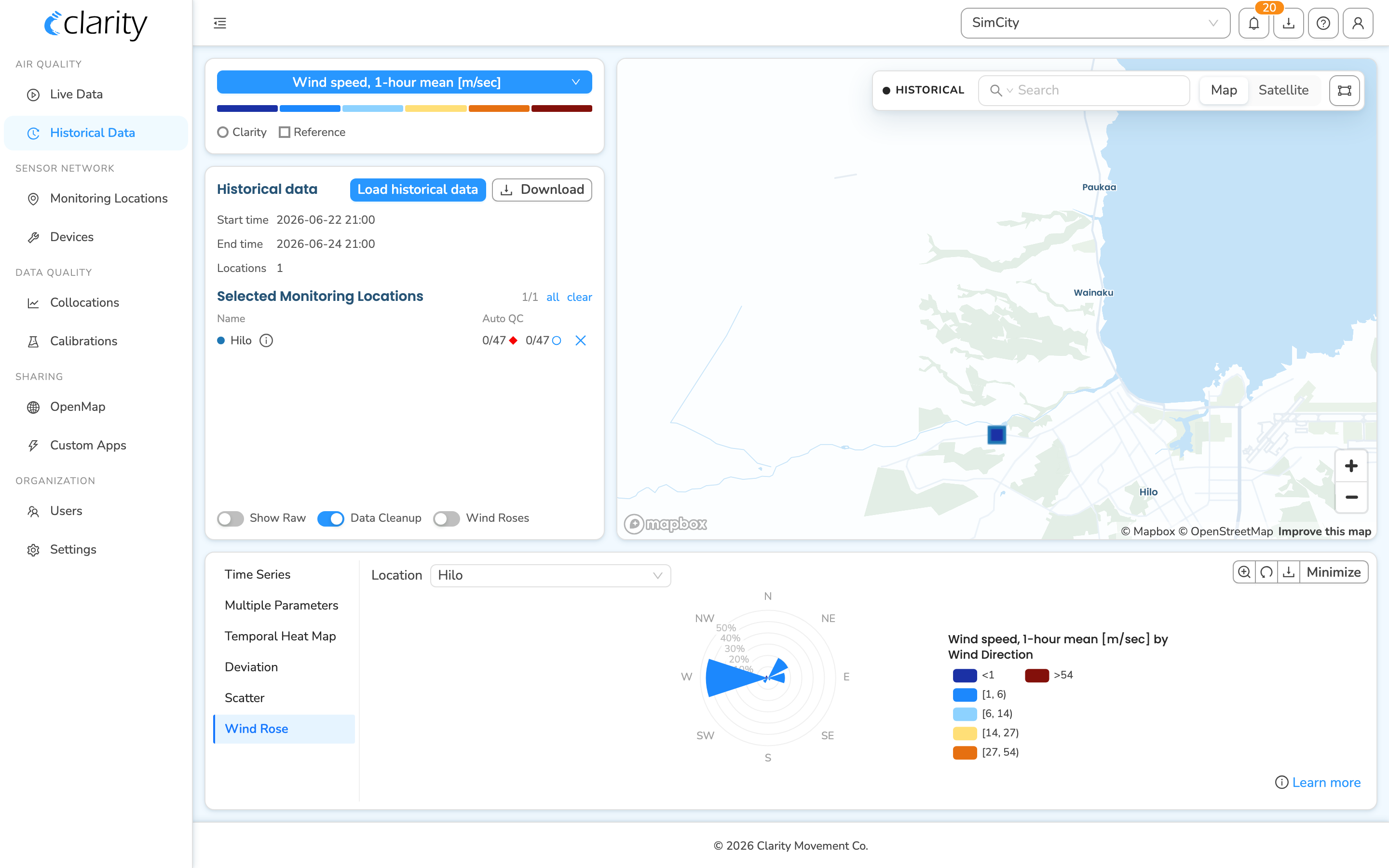
Understanding the Wind Rose
The wind rose summarizes wind direction and speed for the loaded data period.
- The eight sections of the circular wind rose show the direction the wind blew from (N, NE, E, SE, S, SW, W, NW).
- The length of each spoke shows how often (percentage of the sampling period) the wind blew from that direction.
- For example, in a wind rose like this the wind blew from the West for about 35% of the time.
The different colour bands of each spoke show the wind speed in meters per second (m/s). Hover over a spoke to see the details.
- For example, the wind speed was between 6 and 14 m/s for about 18% of the time while it was blowing from the West.
If you select a Wind metric on a set of locations that report no wind data, Dashboard shows a "No wind measurements found" message with a link to learn more about Wind Modules.
Pollution Roses
Instead of visualizing wind speed, you can visualize any pollutant concentration or AQI together with wind direction using a Pollution Rose. To do that:
- While the Wind Rose tab is open, click the blue metric pill again and switch to a pollutant concentration or an AQI metric (for example PM2.5 NowCast AQI (US EPA)).
- The rose's spokes change colour to reflect the new metric.
- Hover over a spoke to see the pollutant concentration or AQI measured while the wind was coming from that direction.
- For example, AQI was moderate for about 3% of the time while the wind was blowing from the South West.
💡 Tip: Pollution Roses can help you answer questions such as:
- Are higher concentrations or AQIs happening mostly when the wind comes from a certain direction?
- Is a known pollution source located to the (e.g.) West of my device impacting air quality at the deployment site?
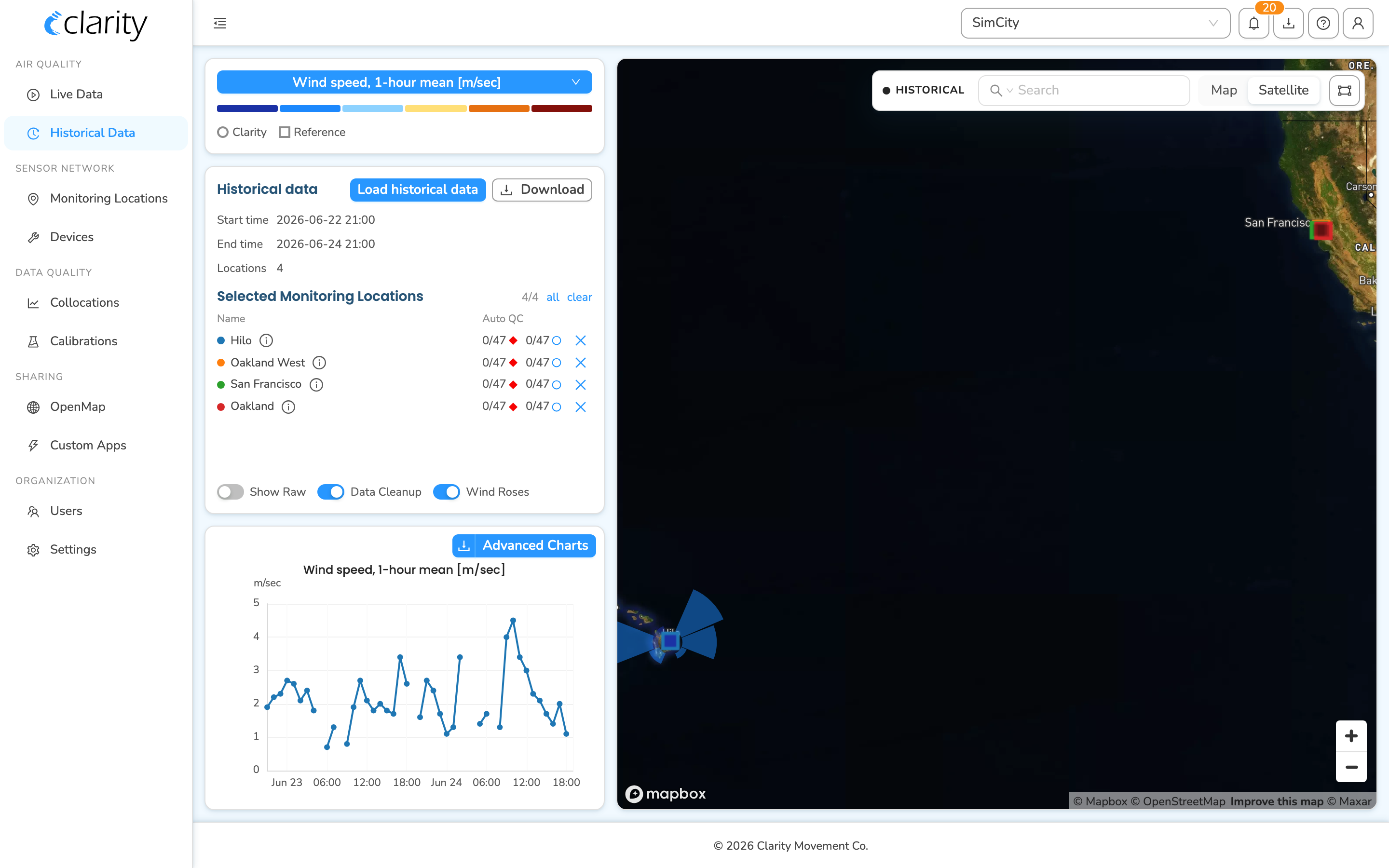
Another way to view Wind and Pollution Roses: on the map
You can also overlay roses directly on the map, on top of the locations you've selected.
- On Historical Data, in the Historical data control panel, turn on the Wind Roses switch (it's in the footer of that panel, next to Show Raw and Data Cleanup).
- Select one or more monitoring locations on the map. Each selected location that has wind data gets a rose drawn over its marker.
- The rose reflects the metric currently chosen in the metric pill — leave it on Wind for a wind rose, or switch to a pollutant/AQI metric for a pollution rose on the map.
Switch the basemap between Map and Satellite using the toggle in the top-right corner of the map.
The map toolbar holds the search box, the Map / Satellite toggle, and a lasso-select tool (drag a shape around markers to add them all to your selection).
What's next
- Deploy your Wind Module.
- Find true north to align the Wind Module.
- Download your air quality data.
- Keep your Wind Module maintained.
Was this article helpful?
Yes, thanks! / Not really
Still need a hand? Email us at support@clarity.io or create a support ticket, and our team will get back to you.