How do I check that a Node-S (and module) is uploading measurements to Dashboard during deployment?
After you deploy a Node-S in the field — and pair an accessory module to it, if you have one — you'll want to confirm it's actually getting online and sending measurements before you leave the site. The fastest way to do that in the Dashboard is the Historical Data page: load the most recent data, pick the parameter your sensor reports, then add the node's monitoring location to the chart and look for recent data points.
Before you start
- The first data point can take up to ~10 minutes to upload after the node powers on, depending on cellular signal strength. If you don't see data immediately, give it a few minutes and reload.
- Measurements roll up on the hour. Once the node is reporting, you'll see hourly measurements appear at the top of each hour on Historical Data, Live Data, and Monitoring Locations.
- Historical Data does not auto-refresh. You have to reload the data window to pull in the newest measurements (covered in the steps below).
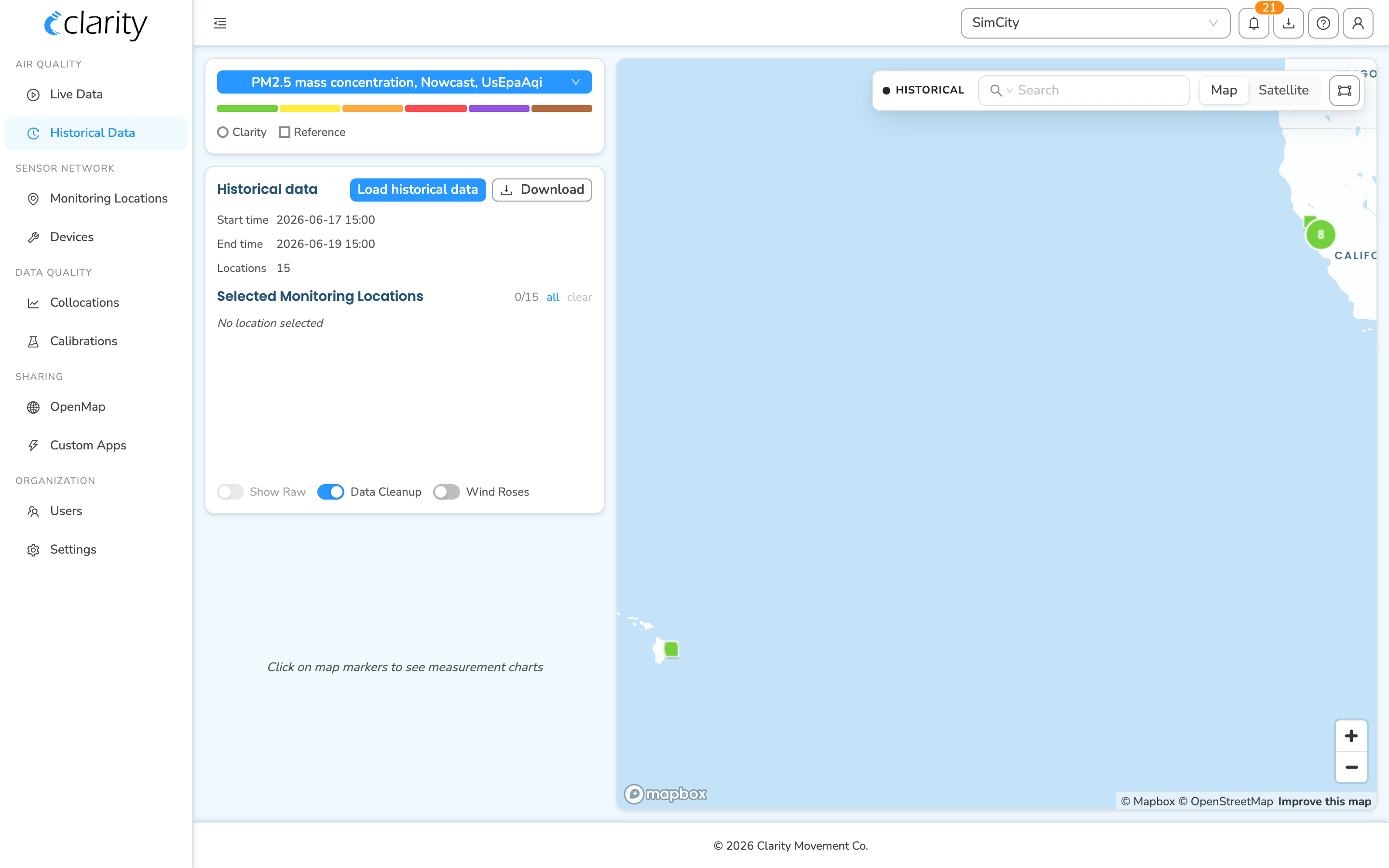
Step 1 — Open the Historical Data page
- Log in to the Clarity Dashboard.
- In the left sidebar, under the AIR QUALITY group, click Historical Data.
The page opens with the metric and data controls on the left and a map of your monitoring locations on the right.
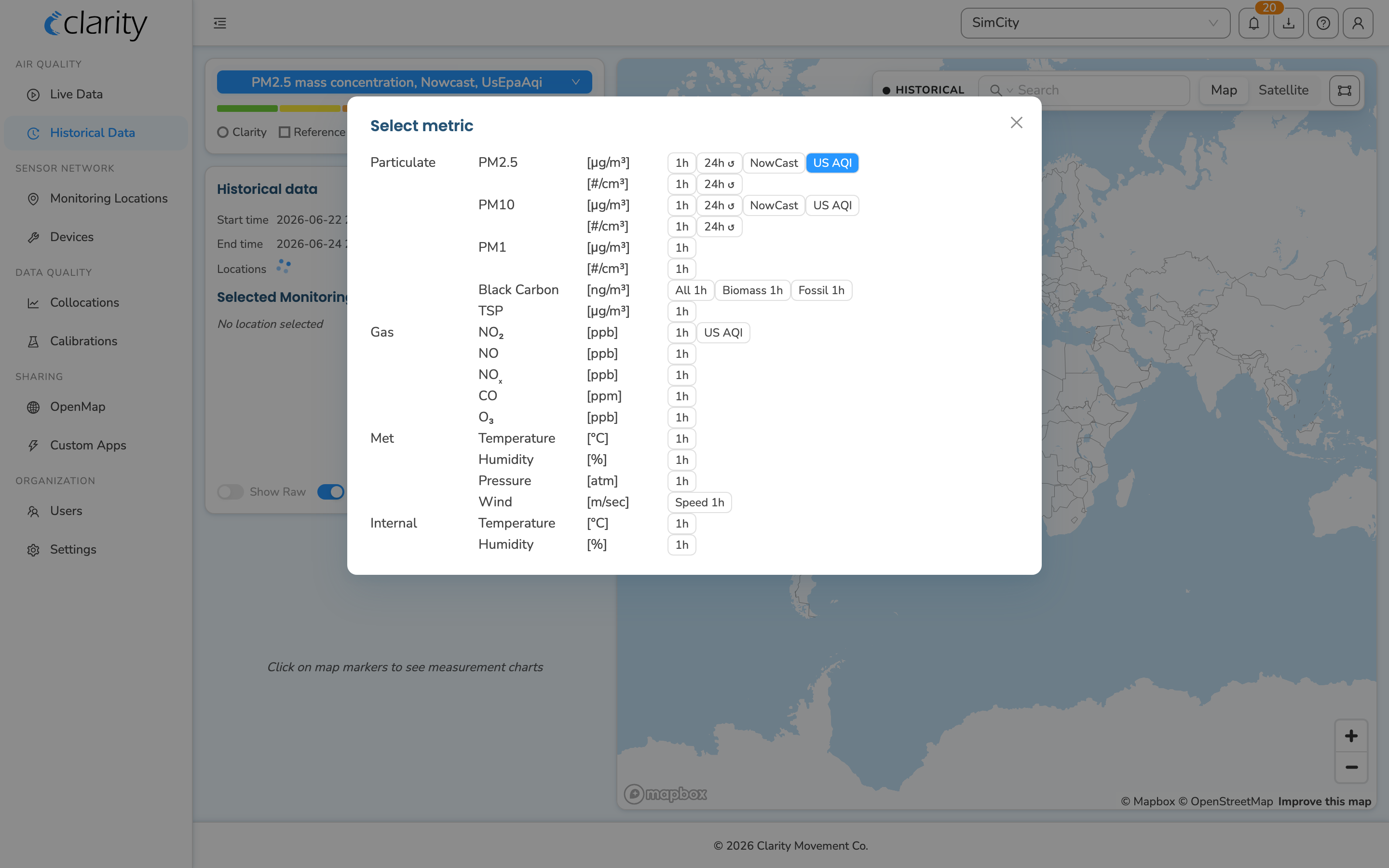
Step 2 — Choose the parameter your sensor reports
The parameter selector lives in the metric card at the top-left of the page (it's the blue pill — in the screenshot it reads "PM2.5 mass concentration, Nowcast, UsEpaAqi").
- Click the metric pill.
- Pick your parameter of interest, then drill into the highest-resolution / concentration option. For example: PM2.5 → Highest Resolution → Mass Concentration.
The pill only lists parameters your organization actually tracks at the current output frequency, so if you don't see a parameter, switch the output frequency in the Load step below (minute resolution exposes the most parameters) and check again.
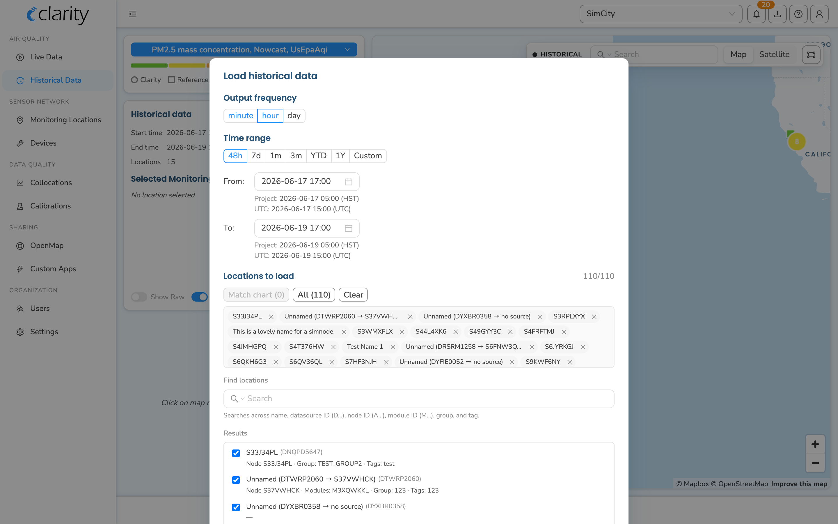
Step 3 — Load the most recent data
Because the page doesn't auto-refresh, load a fresh window that includes "now":
- In the Historical data card (left column), click the blue Load historical data button.
- In the Load historical data modal:
- Set Output frequency to minute (radio buttons: minute / hour / day). Minute resolution shows the very first data points as soon as they arrive, which is exactly what you want during a deployment check.
- Set the Time range to a window that ends at the current time (the default is the last 48 hours).
- Under Locations to load, choose the monitoring location(s) you want to pull. You can:
- search by name / group / tag / ID and tick locations in the Results list, or
- expand Add by ID list and paste the datasource ID (D…), node ID (A…), or module ID (M…) — handy when you only have the node's serial on hand in the field.
- Click Load N locations.
The modal closes, the map refits to the loaded locations, and the Start time / End time / Locations summary in the Historical data card updates to the window you loaded.
Step 4 — Add the node's location to the chart and check for recent data
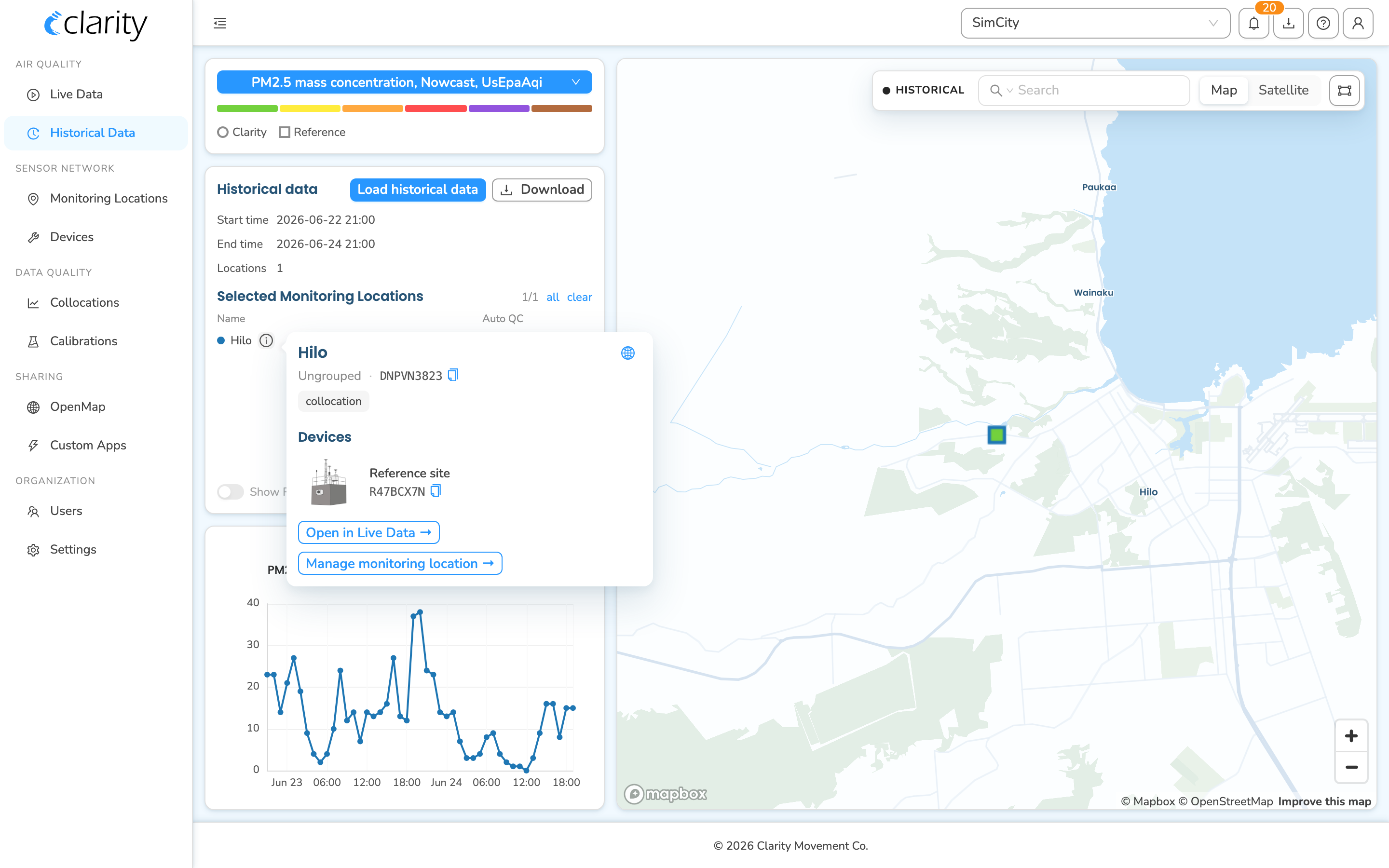
Clicking a location's map marker adds it to the chart:
- Find your node on the map. To locate it quickly, use the search box in the top-right map controls. Click the search prefix to switch the scope to ID, then type the node ID (A…) or datasource ID (D…) — the map filters to matching markers. (You can also scope by Name, Group, or Tag.)
- Click the marker for your monitoring location. It's added to the Selected Monitoring Locations list in the Historical data card, gets a colored dot, and a chart appears in the left column plotting its measurements.
- If you see recent data points in the chart, the node is uploading. At minute resolution, the newest points should fall within the last several minutes of the window you loaded.
Tip: if markers are stacked (for example a node and a collocated reference), clicking the cluster fans them out so you can pick the exact one. For a wider sweep you can also use the lasso tool (the rectangle icon in the map controls) to add every marker inside a shape you draw.
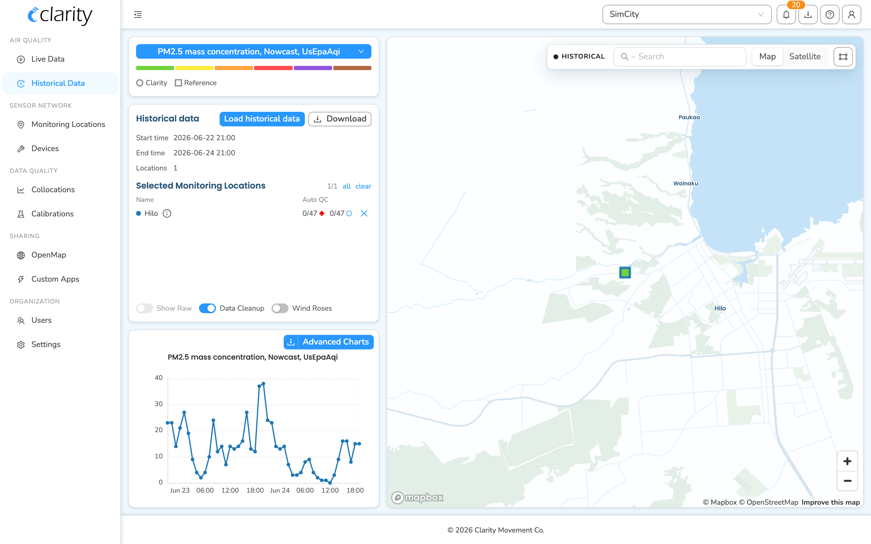
Reading the per-location details
Each row in the Selected Monitoring Locations list has an info (ⓘ) button. Click it to see the location header plus the device block (which node and any paired module are behind this location, plus their status), and quick links to open this location in Live Data or in the Monitoring Network.
The two small glyphs on each row are Auto QC stats for the loaded window: the red rhombus is the QC-invalid count and the blue circle is the calibration-missing count, each shown as a fraction of total measurements.
Step 5 — Confirm the module too (if you deployed one)
If you paired an accessory module (an M… device — for example a wind or gas module) to the node, confirm its parameters are flowing as well:
- Back in Step 2, switch the metric pill to a parameter the module reports (e.g. wind speed/direction, or the relevant gas).
- Re-run Step 3 (Load historical data) if needed so the window covers the module's data, then re-check the chart for the same location.
The module reports through the same monitoring location as its host node, so you don't need to select a separate marker — just change the parameter.
If you don't see data yet
- Wait a few minutes and click Load historical data again — it doesn't refresh on its own, and you must reload to pull the newest measurements. Always load a window that ends at the current time.
- Make sure Output frequency is set to minute so the earliest individual points show up rather than waiting for an hourly roll-up.
- Note the Data Cleanup toggle at the bottom of the Historical data card: when it's on, values that are QC-invalid or missing calibration are filtered out of the chart. A freshly deployed node may not be calibrated yet, so its early points can be hidden by Data Cleanup — turn it off temporarily to confirm raw measurements are arriving.
- The first point can take up to ~10 minutes to arrive on a weak signal.
- Use the info (ⓘ) button on the location row to check the device's status, or jump to Live Data for the location's current value.
What's next
- Deploy your Clarity Node-S.
- Get an overview of your network on Live Data.
- Troubleshoot a Late Reading Alarm.
- Subscribe to device alarms on Dashboard.
Was this article helpful?
Yes, thanks! / Not really
Still need a hand? Email us at support@clarity.io or create a support ticket, and our team will get back to you.