Viewing and interpreting data from the Black Carbon Module on Dashboard
Note: Black Carbon measurements require a Clarity Black Carbon add-on Module. Contact us to add Black Carbon monitoring capabilities to your sensor network.
What is black carbon?
Black carbon (BC), sometimes referred to as "soot", is a component of fine particulate matter formed during incomplete combustion of fossil fuels and biomass. BC is an important contributor to global warming and is known to have harmful effects on human health. Unlike other components of particulate matter, BC is only formed during combustion. Common emissions sources of BC include:
- Vehicle (both gas and diesel) engines
- Coal-fired power plants
- Industrial activities
- Biomass burning (e.g., wildfires, brush fires, residential wood heating)
BC is never emitted in isolation; there are always co-emitted products (e.g., organic carbon or organic matter). In addition to contributing further to poor air quality, assumptions about these co-emitted products are used to identify the source category of the BC emissions (fossil fuel or biomass). For wood burning, the mass of organic matter is typically 5–10x higher than that of BC, which helps identify biomass burning sources.
Where black carbon data lives in the dashboard
Black carbon measurements are explored on the Historical Data page. In the left sidebar, Historical Data sits under the AIR QUALITY group:
- AIR QUALITY — Live Data · Historical Data
- SENSOR NETWORK — Monitoring Locations · Devices
- DATA QUALITY — Collocations · Calibrations
- SHARING — OpenMap · Custom Apps
- ORGANIZATION — Users · Settings
Historical Data is a map-driven explorer: pick your monitoring location(s) on the map, load a time window, choose the black carbon parameter, then open the advanced charts to see source attribution and pollutant comparisons.
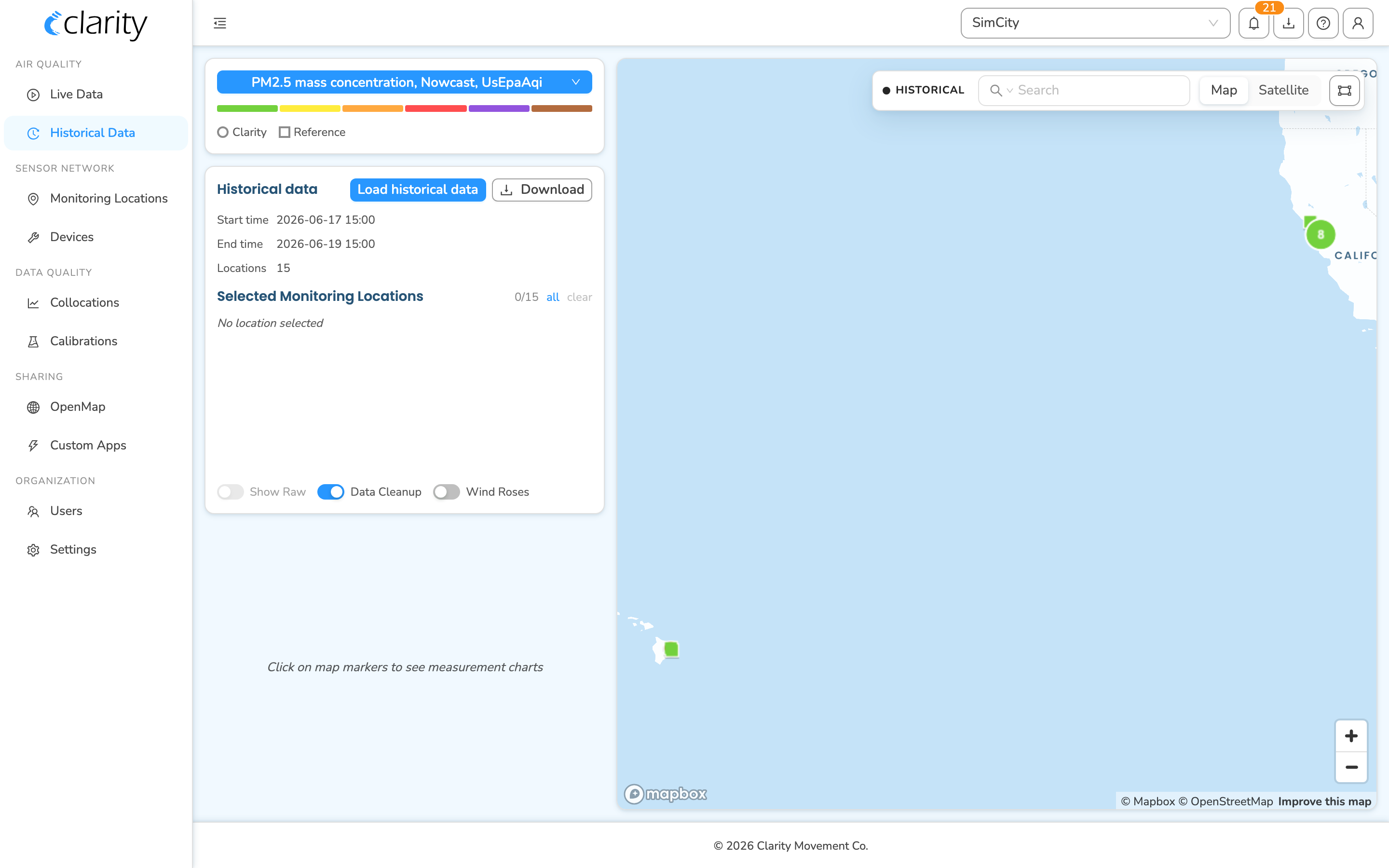
Step 1 — Open Historical Data and select your location
Once your Clarity Node-S has been configured and paired with your Black Carbon Module, you can use the dashboard to view its data.
- In the left sidebar, under AIR QUALITY, click Historical Data.
- On the map (right side of the page), click the marker for the monitoring location whose source device is paired to a Black Carbon Module. The location is added to the Selected Monitoring Locations list in the left-hand "Historical data" card, and its measurement chart appears below.
- You can select more than one location to compare them — click additional markers, use the all shortcut next to Selected Monitoring Locations, or lasso a group on the map.
- Use the map's Search box (top of the map) to find a location by name, group, or tag.
Tip: You can also jump straight here for a specific device. On Devices (under SENSOR NETWORK), on the Deployed devices tab, open a row's ⋮ menu and choose Load historical data. That opens the Load historical data dialog pre-staged with that location and lands you on Historical Data.
Step 2 — Load a time window
In the left Historical data card, click Load historical data. In the Load historical data dialog:
- Output frequency — choose minute, hour, or day. For black carbon interpretation, hour is the usual choice.
- Time range — pick the start/end of the window you want to inspect.
- Locations to load — confirm the monitoring location(s); add more here if needed. Use the Match chart quick action to load exactly what you have selected on the map.
Click Load (the button reads Load N locations). The card's Start time / End time / Locations summary updates and the chart redraws for the new window.
The footer of the Historical data card has three toggles:
- Show Raw — show raw, non-calibrated measurements. (Disabled for index/NowCast metrics, where raw mode is not meaningful.)
- Data Cleanup — removes QC-invalid values and values missing calibration. Leave this on for a clean view.
- Wind Roses — overlays wind roses on the map for selected locations that have wind data (independent of the chart).
Step 3 — Choose the black carbon parameter
At the top of the left column is the metric card. Click the blue metric button (it shows the current parameter and a chevron) to open the metric picker, then choose the black carbon parameter:
- Black carbon All sources mass concentration, 1-hour mean — the total BC concentration. (Black carbon parameters appear in the picker only for organizations that report black carbon.)
Once selected, the metric button and the chart title update to the black carbon parameter (with its ng/m³ unit).
How to read the All Sources time series
- As a reference point, annual average BC concentrations in rural areas are roughly 0–500 ng/m³. In urban areas under moderate traffic and combustion, the range is about 500–2,500 ng/m³. Heavily polluted areas may exceed 5,000 ng/m³ on an annual average.
- Over several days, hourly BC may drop near zero when combustion influence is low, and peak in the thousands when local air quality is heavily impacted by combustion sources.
- In traffic-heavy urban areas it is common to see BC peaks repeating around the same time each day (e.g., morning commute). In areas with residential wood-burning, peaks often appear in the evening. Regions affected by wildfires, brush fires, or agricultural burning see transient peaks during their burn season.
Step 4 — See the source attribution (Biomass vs Fossil fuel)
Source apportionment (the biomass vs fossil-fuel split) lives on its own Source Apportionment chart tab in the Advanced Charts view. This tab appears only when the selected parameter is a black-carbon sources parameter.
- With a black carbon parameter selected, open the larger chart view: in the compact chart card, click Advanced Charts (top-right of the chart).
- In the Advanced Charts panel, the left rail lists chart types. Select Source Apportionment.
- This tab is present only for black carbon parameters that carry the biomass/fossil-fuel breakdown. If you don't see it, confirm your parameter is a black carbon parameter and that the location's device is paired to a Black Carbon Module.
- The Source Apportionment chart shows, for one location:
- Biomass and Fossil fuel as stacked bars (they sum to total BC), and
- All sources as a line tracing the total on top.
- If you have several locations selected, use the Location picker above the chart to choose which one to apportion.
How to interpret it:
- This plot shows how biomass and fossil-fuel sources contribute to overall BC over time.
- Periods with increasing fossil fuel contributions may be associated with vehicular traffic (which often repeats at similar times of day), industrial activity, or power plants.
- Periods with increasing biomass contributions may indicate wildfires, brush fires, or residential heating.
- Compare each source's trend over time — for example, is the biomass contribution higher today than yesterday? Consider the site's location, too: a site near a busy highway may show a larger fossil-fuel than biomass contribution even on a wildfire-impacted day, because of the proximity of the traffic source.
Step 5 — Compare black carbon with PM2.5
Two purpose-built chart tabs in the Advanced Charts view let you compare black carbon with PM2.5. Open Advanced Charts (Step 4), then use the left rail:
Overlay the two trends — Multiple Parameters tab
- Select the Multiple Parameters tab.
- Pick the location in the Location dropdown.
- In the Second Metric dropdown, choose PM2.5 mass concentration.
- The chart overlays the two time series on a dual axis (black carbon on one axis, PM2.5 on the other) so you can compare their trends directly.
See the correlation — Scatter tab
- Select the Scatter tab.
- Choose the two series with the X Axis and Y Axis location pickers.
- The scatter plot draws a regression line and reports the correlation (R²) in the chart.
How to interpret the comparison:
- A strong correlation between PM2.5 and BC suggests fresh combustion emissions played a major role in air quality.
- A weak correlation suggests there may be significant non-combustion sources of PM2.5.
Step 6 — Export the data
You have two export paths:
- Download CSV — click Download in the Historical data card to export the loaded measurements as a
.csv(a chooser lets you pick a direct download or a backend report request). - Download chart image — each chart's toolbar has a Download as image button to save the current plot as an image. The Advanced Charts toolbar also offers Zoom to selection and Reset zoom.
What's next
- Deploy your Black Carbon Module.
- Keep your Black Carbon Module maintained.
- Download your air quality data.
- Troubleshoot Accessory Module alarms.
Was this article helpful?
Yes, thanks! / Not really
Still need a hand? Email us at support@clarity.io or create a support ticket, and our team will get back to you.